SA
Givelify
PRODUCT DESIGN - DONATION APP
Overview
Aventon ebikes are one of the most popular and reliable ebike company right now in America. The
What I worked on:
PRODUCT DESIGN
DASHBOARD RE-DESIGN
USER TESTING
UI/UX
3RD PARTY INTEGRATIONS
FINTECH
ECOMMERCE SALES
SAAS PLATFORM
USER INTERVIEWS
Givelify Donation App
Aventon hired me to help own a complete site redesign, app design support, and a B2B custom solution as well. Major milestones working for Aventon incude site overhaul, ongoing custom ecommerce solutions that have contributed to increased sales and reduced bike returns. While working fully remote, I have come to help Aventon achieve stronger sales through their updated ecommerce site and custom B2B solutions.
The problem
Top to bottom redesign of the entire application to be more functional and provide actionable insights
My first task at Aventon was to begin making changes to their product detail page and their product listing page. Aventon was using a very basic Shopify template that did not suit their needs. I helped create a new user experience that increased sales and increased order value. The image below shows a desktp and mobile design showing an accessory widget that allows users to add additional products to cart.
Prodct Detail Page
After many hours of interviews, research, testing, I finally landed on a new design that was working. Because of the nature and complexity, this tool was determined to be successful based on user testing, both blind testing as well as live interviews. We were able to determine the new design successful for a V1 to build and release. I started with a new dashboard based on stats that users cared about, deployed with a new skin tool wide while introducing enhancements with each new round of improvements.
Prodct Detail Page
The problem
Design a plan configure page for the sales for for Xfininty
My first task at Aventon was to begin making changes to their product detail page and their product listing page. Aventon was using a very basic Shopify template that did not suit their needs. I helped create a new user experience that increased sales and increased order value. The image below shows a desktp and mobile design showing an accessory widget that allows users to add additional products to cart.
Prodct Detail Page
Prodct Detail Page
The problem
Communication tool
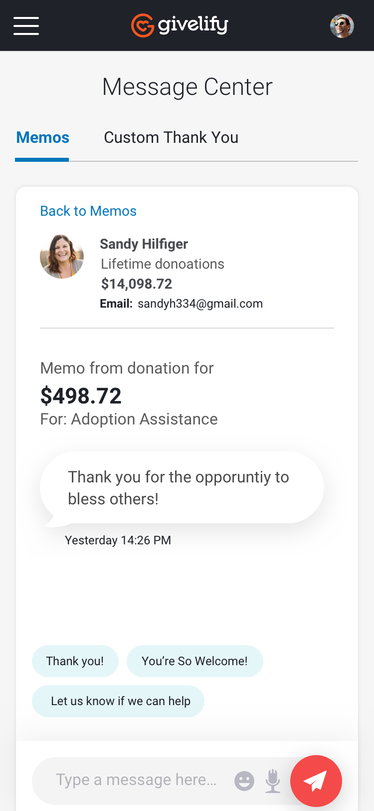
The Givelify platform allows the organization admin communicate to their donors directly in the app. We needed a simple interface to allow for basic messaging.
Prodct Detail Page
View other projects
A little line about what’s being said and who’s saying it.


SA
Givelify
PRODUCT DESIGN - DONATION APP
Overview
Aventon ebikes are one of the most popular and reliable ebike company right now in America. The
What I worked on:
PRODUCT DESIGN
DASHBOARD RE-DESIGN
USER TESTING
UI/UX
3RD PARTY INTEGRATIONS
FINTECH
ECOMMERCE SALES
SAAS PLATFORM
USER INTERVIEWS
Givelify Donation App
Aventon hired me to help own a complete site redesign, app design support, and a B2B custom solution as well. Major milestones working for Aventon incude site overhaul, ongoing custom ecommerce solutions that have contributed to increased sales and reduced bike returns. While working fully remote, I have come to help Aventon achieve stronger sales through their updated ecommerce site and custom B2B solutions.
The problem
Top to bottom redesign of the entire application to be more functional and provide actionable insights
My first task at Aventon was to begin making changes to their product detail page and their product listing page. Aventon was using a very basic Shopify template that did not suit their needs. I helped create a new user experience that increased sales and increased order value. The image below shows a desktp and mobile design showing an accessory widget that allows users to add additional products to cart.
Prodct Detail Page
My first task at Aventon was to begin making changes to their product detail page and their product listing page. Aventon was using a very basic Shopify template that did not suit their needs. I helped create a new user experience that increased sales and increased order value. The image below shows a desktp and mobile design showing an accessory widget that allows users to add additional products to cart.
Prodct Detail Page
The problem
Design a plan configure page for the sales for for Xfininty
My first task at Aventon was to begin making changes to their product detail page and their product listing page. Aventon was using a very basic Shopify template that did not suit their needs. I helped create a new user experience that increased sales and increased order value. The image below shows a desktp and mobile design showing an accessory widget that allows users to add additional products to cart.
Prodct Detail Page
Prodct Detail Page
The problem
Communication tool
The Givelify platform allows the organization admin communicate to their donors directly in the app. We needed a simple interface to allow for basic messaging.
Prodct Detail Page
View other projects
A little line about what’s being said and who’s saying it.
Scott Adams
Givelify
PRODUCT DESIGN - DONATION APP
Overview
Givelify (Give li fi), is a Fintech product and the number 1 donation app for small churches and charitable organizations.
What I worked on:
PRODUCT DESIGN
DASHBOARD RE-DESIGN
USER TESTING
UI/UX
3RD PARTY INTEGRATIONS
FINTECH
DATA VISUALIZATION
SAAS PLATFORM
USER INTERVIEWS
Givelify Donation App
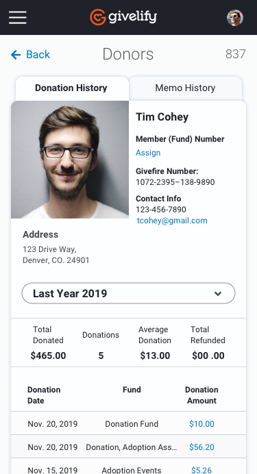
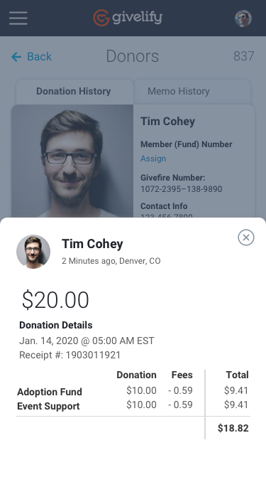
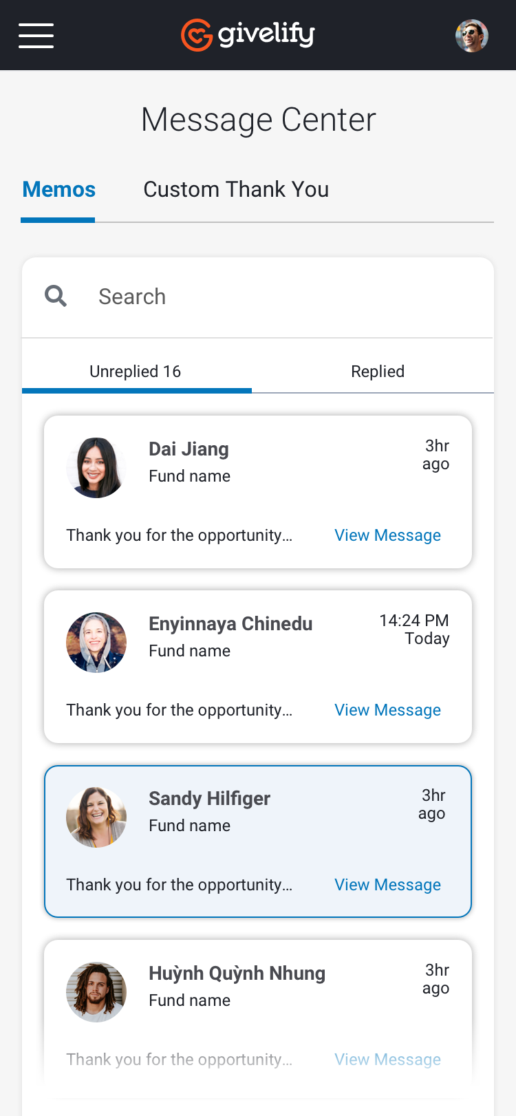
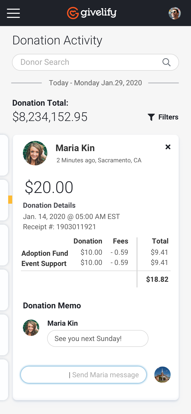
Givelify hired me to help redesign their desktop application which provides all data related to the donations in their organization. The main features I focused on was a dashboard that was customizable to the data that was most important to each organization, third party integrations that connected into the Givelify system, a user communication tool and user donation tracking, as well as funds allocation use.
The problem
Top to bottom redesign of the entire application to be more functional and provide actionable insights
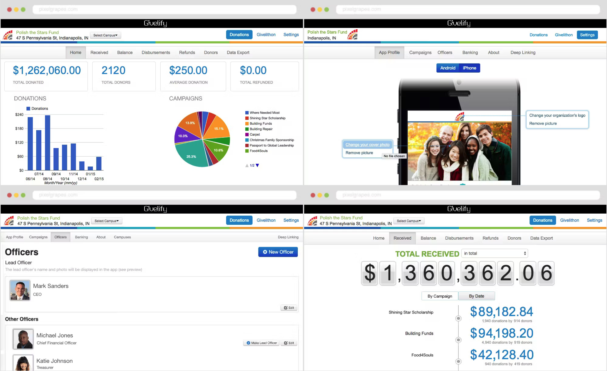
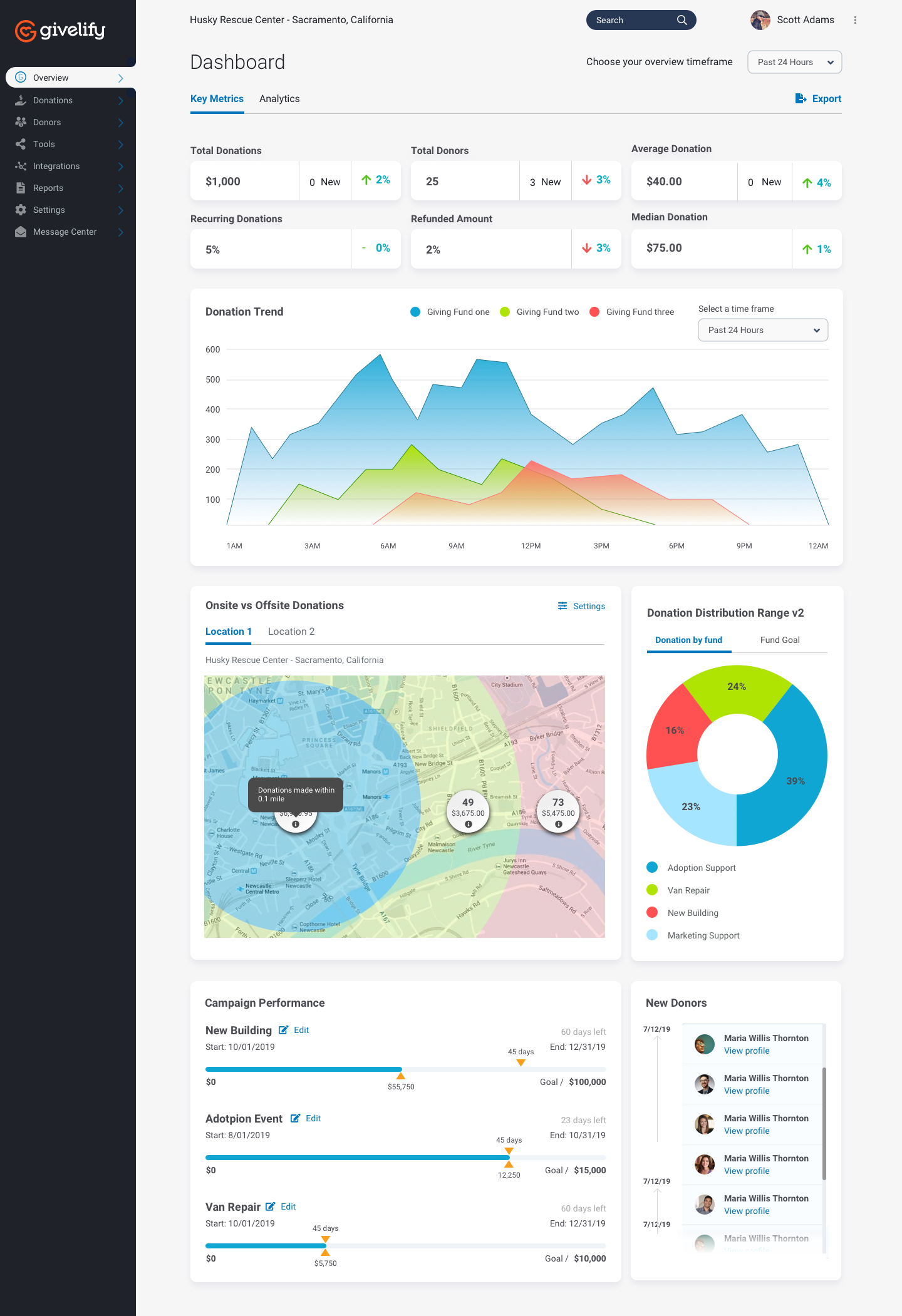
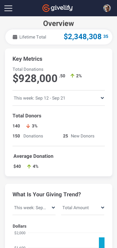
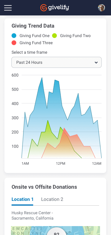
This project was a challenging from the start and resulted in a huge improvement for the users of the product. The company was going through a rebrand during the new design, which required creating a design system as I worked so that updates could be made later to all the underlying design. The dashboard seen below served as the main window into the system. Understanding this dashboard required lots of research, user interviews, and user testing as I progressed through this design work.
Original Dashboard
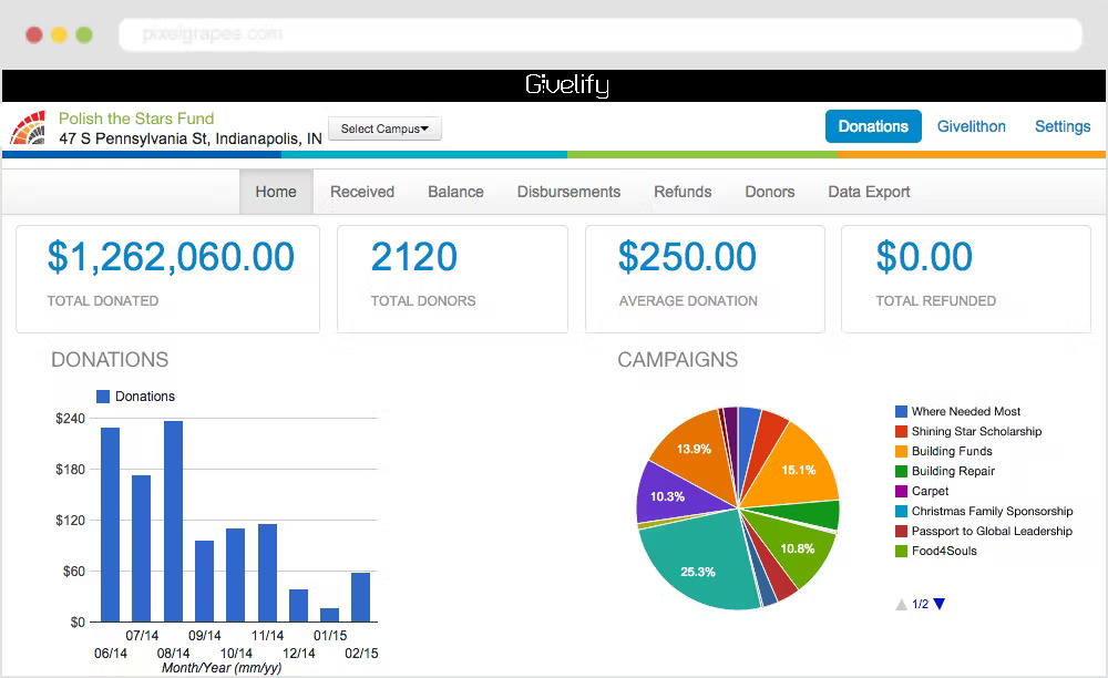
The original Givelify tool was very hard to navigate and outdated with design. As they were going through a rebranding, I was the only designer tasked to work on all UX/UI user research, creating of design system to help create a new tool used for both customers and admin roles. The previous version was very hard to use. My approach was to first learn the existing software, then interview users, wireframe new flows, test, iterate, test again, deploy. Below are a few screenshots of the old version.
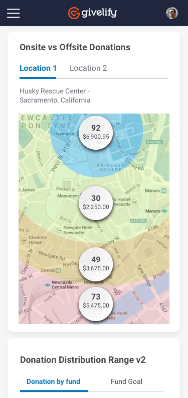
New Dashboard
After many hours of interviews, research, testing, I finally landed on a new design that was working. Because of the nature and complexity, this tool was determined to be successful based on user testing, both blind testing as well as live interviews. We were able to determine the new design successful for a V1 to build and release. I started with a new dashboard based on stats that users cared about, deployed with a new skin tool wide while introducing enhancements with each new round of improvements.
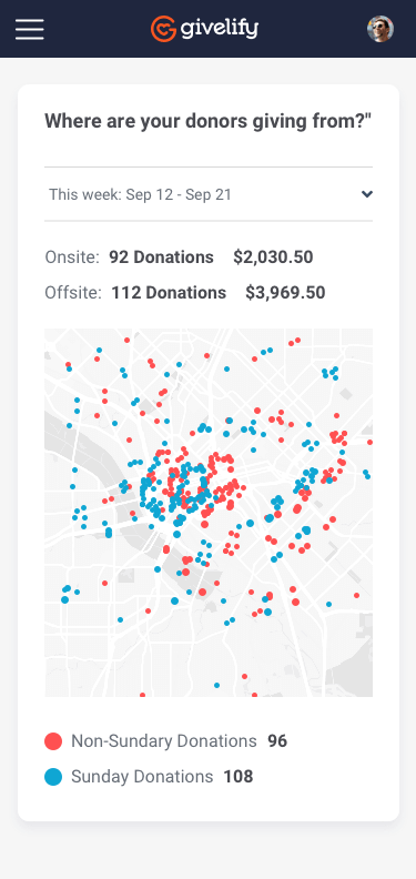
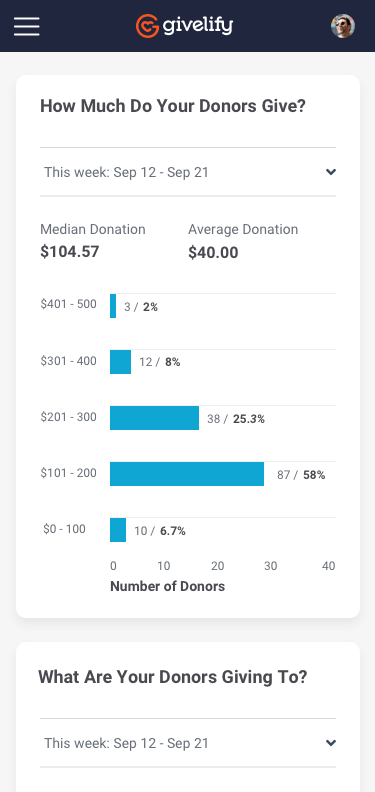
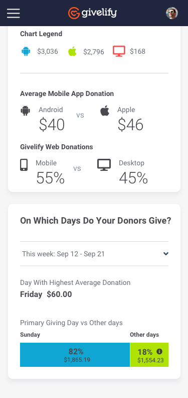
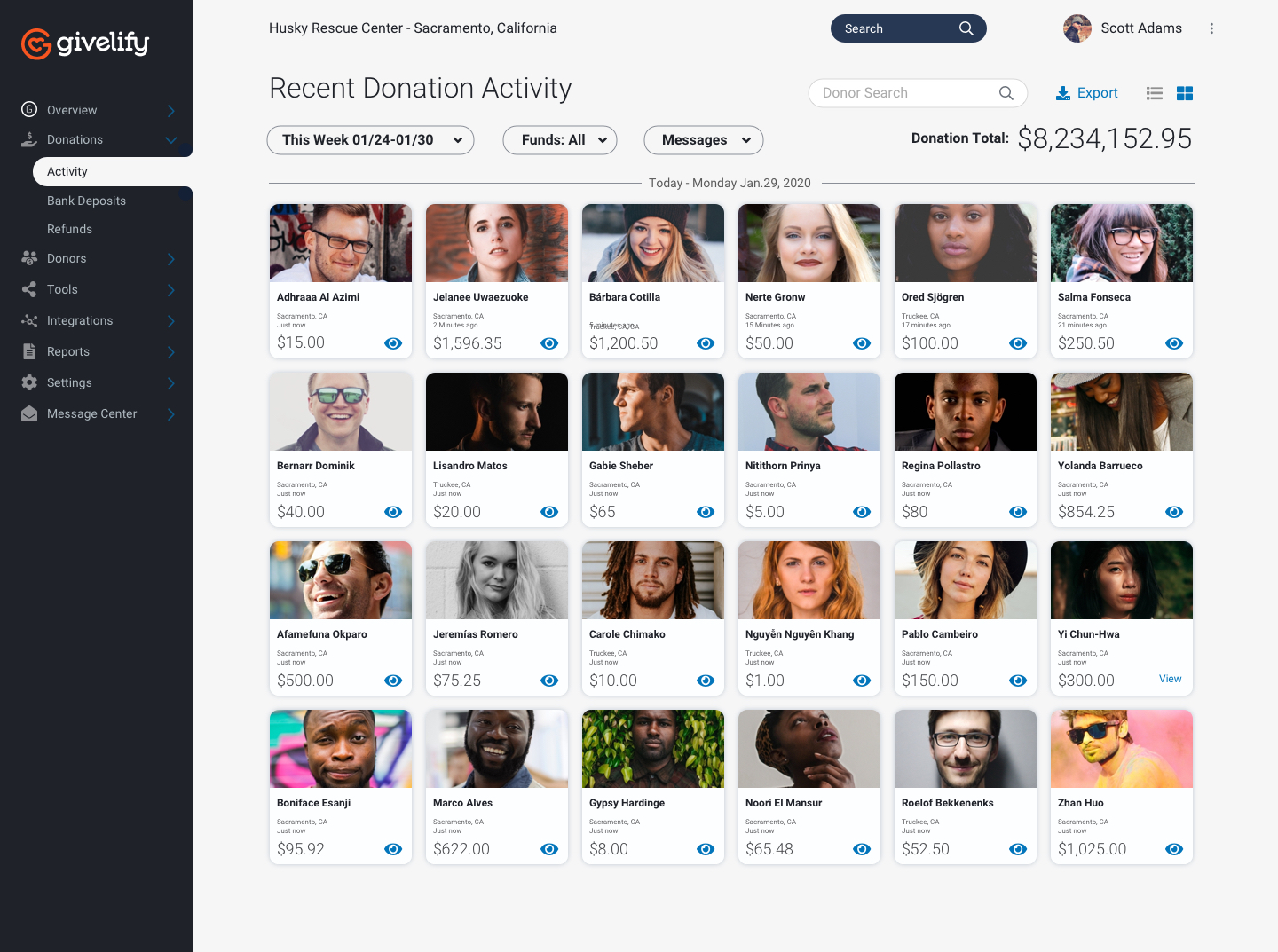
Home page mobile view
The problem
Design a plan configure page for the sales for for Xfininty
The details of each providers plan included a series of steps including configuring the plan, scheduling the install if needed, and other steps related to completing the order. This page was meant to be very similar to a product detail page you see on most e-commerce platforms. The goal was to create a design that was easy to use on desktop and mobile and making it clear to users what to they are being asked to do.
Plan configure page
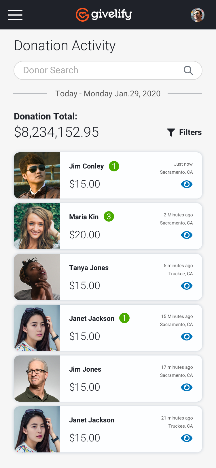
Home page mobile view
The problem
Communication tool
The Givelify platform allows the organization admin communicate to their donors directly in the app. We needed a simple interface to allow for basic messaging.
Home page mobile view
View other projects
A little line about what’s being said and who’s saying it.
Scott Adams